Crochet Bouquet Color Planning Guide
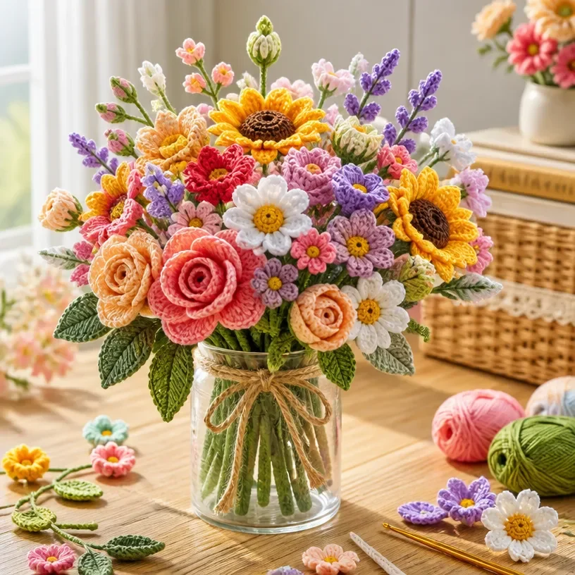
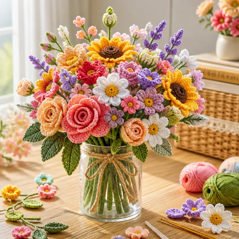
A crochet flower bouquet is defined as much by its color story as by its blooms. This design concept centers on planning a cohesive arrangement of handmade flowers, with the palette guiding the mood, focal point, and overall presentation. Rather than treating each flower as an isolated project, a bouquet-centered approach considers how colors repeat, contrast, and move across the arrangement.
The strongest visual lesson is that color planning can make a collection of crochet flowers feel intentional. A limited palette may create a soft, coordinated display, while carefully chosen contrast can give the bouquet more energy and definition. This makes the idea useful for floral decor, handmade gifts, occasion styling, and any project where the flowers need to read as one unified composition.
The Design Behind This Crochet Flower Idea
This project is best understood as a floral design concept rather than a technical crochet pattern. Its focus is the relationship between handmade flowers and the colors selected for the bouquet.
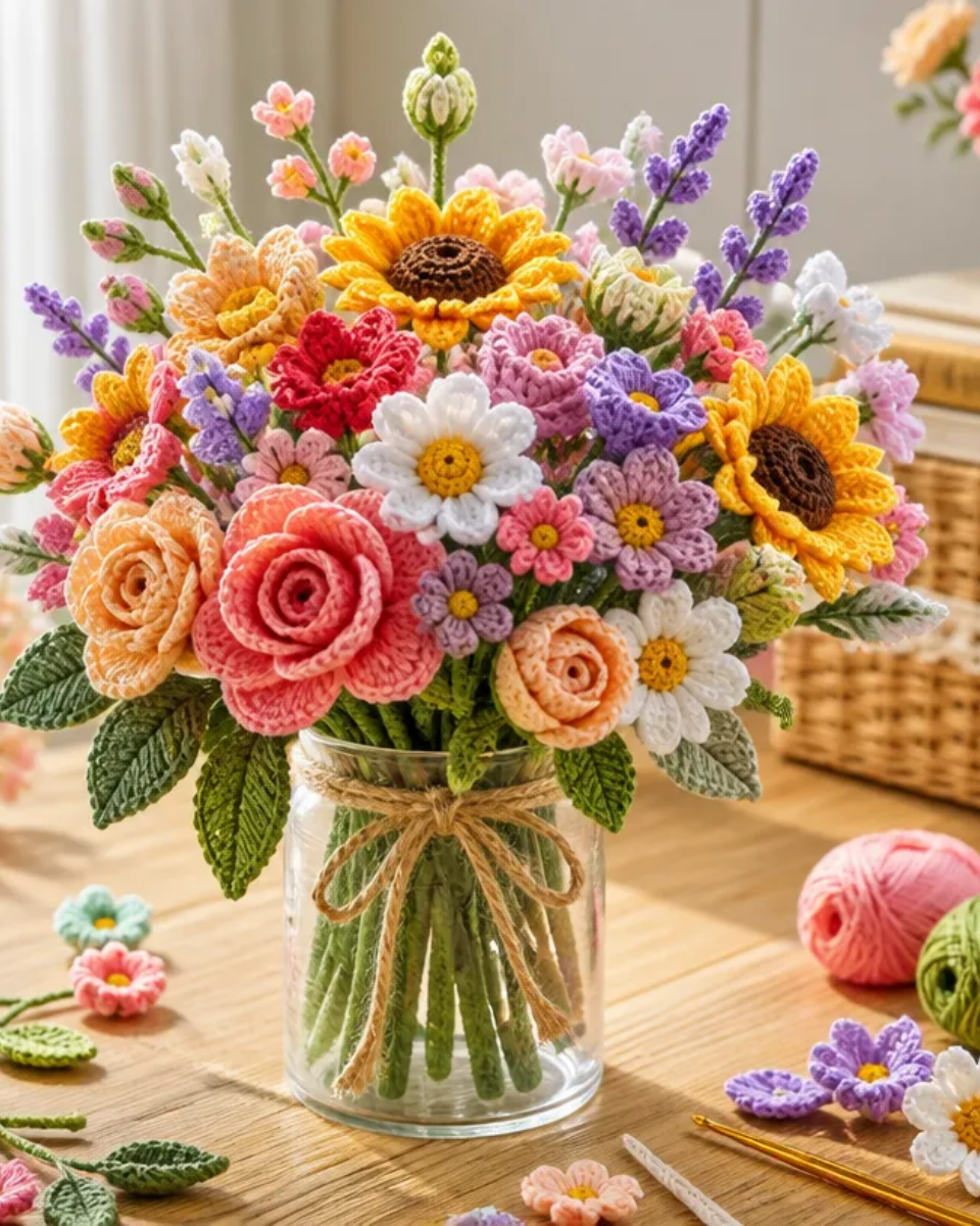
A successful crochet flower bouquet usually benefits from a clear visual hierarchy:
- One color or flower group can act as the main focal point.
- Secondary colors can support the central flowers without competing with them.
- Repeated shades can connect separate blooms into a unified arrangement.
- Small color accents can add liveliness without overwhelming the composition.
- The presentation can reinforce whether the bouquet feels romantic, modern, seasonal, or playful.
The bouquet’s character depends on balance. A design made entirely from equally strong colors may feel energetic but visually busy. A palette with one dominant shade and quieter supporting tones often creates a calmer, more polished impression.
Materials Identified
Materials are not specified in the available project information. This article therefore focuses on the bouquet’s visual planning, color relationships, and styling possibilities rather than providing a supply list.
Planning the Bouquet’s Visual Composition
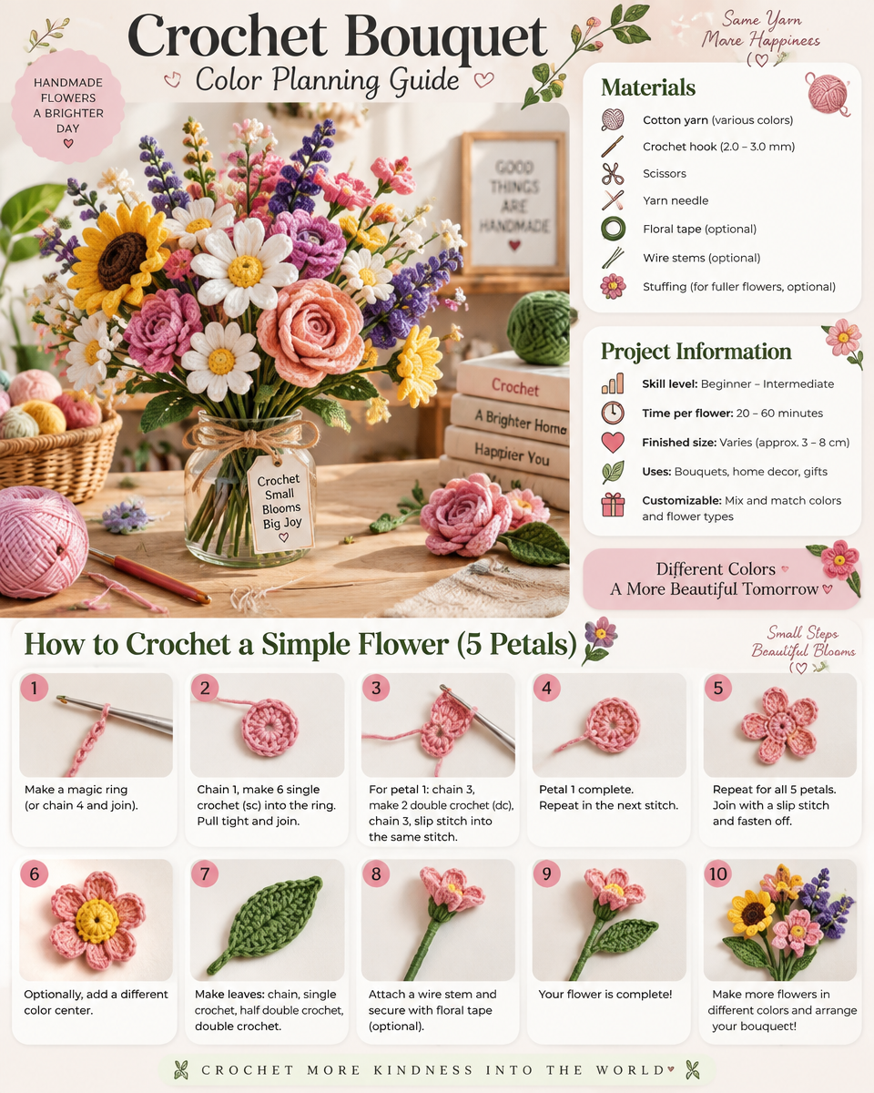
Color planning is most effective when considered alongside bouquet composition. Even without reconstructing the hidden construction of a floral project, it is possible to think carefully about how the finished arrangement should look as a whole.
Establishing a focal point
A bouquet often benefits from a clear focal area. This may be created through a stronger color, a brighter accent, or a cluster of flowers that immediately draws attention. The focal point does not need to sit at the exact center; an offset emphasis can make the arrangement feel more natural and visually relaxed.
For a softer bouquet, the focal flowers can remain close in tone to the supporting flowers. For a bolder design, the focal area can use a noticeably contrasting shade.
Supporting the main flowers
Supporting flowers help distribute color through the bouquet. Rather than introducing many unrelated shades, consider repeating one or two colors in different parts of the arrangement. This creates continuity and prevents the focal flowers from looking disconnected.
A restrained palette can make even a varied group of crochet flowers feel coordinated. The flowers may differ in shape or size, but shared color relationships help them belong to the same bouquet.
Considering visual density
Color affects how dense a bouquet appears. Darker or more saturated shades tend to attract attention and can make a small group of flowers feel visually substantial. Pale or closely related colors may create a lighter, more spacious impression.
This does not require technical changes to the flowers. It is simply a way to anticipate how the finished color arrangement may read from a distance and up close.
Balancing the silhouette
The outer shape of a bouquet matters as much as the individual flowers. A rounded arrangement may feel traditional and abundant, while a looser distribution can appear more garden-inspired. Color placement can reinforce that silhouette: concentrated color can define the center, while scattered accents can draw the eye outward.
The goal is not perfect symmetry. A thoughtfully varied arrangement often feels more organic, especially when color is distributed with intention rather than placed identically on each side.
Exploring Crochet Bouquet Color Palettes
A color palette gives the bouquet its emotional tone. The same collection of handmade flowers can look delicate, cheerful, dramatic, or contemporary depending on the relationship between its colors.
Monochromatic and tonal palettes
A monochromatic bouquet uses variations of one basic color family. This approach can range from very subtle, with closely related shades, to more expressive, with light, medium, and deep versions of the same hue.
Tonal palettes are especially useful when the flowers themselves have varied shapes or textures. Keeping the colors related allows the floral forms to remain the main source of interest.
Soft, romantic combinations
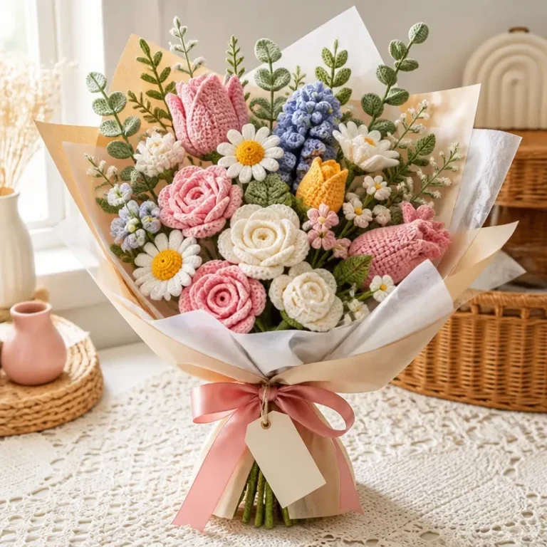
Blush, cream, muted rose, and other gentle tones can suggest a romantic presentation. These colors suit gift styling, wedding-inspired displays, and delicate shelf or table decor.
The key is to preserve enough tonal variation that the bouquet does not appear flat. A slightly deeper accent can help define the flower group while keeping the overall mood soft.
Cheerful mixed colors
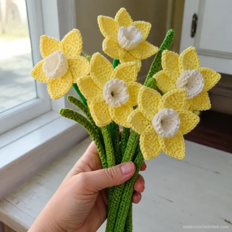
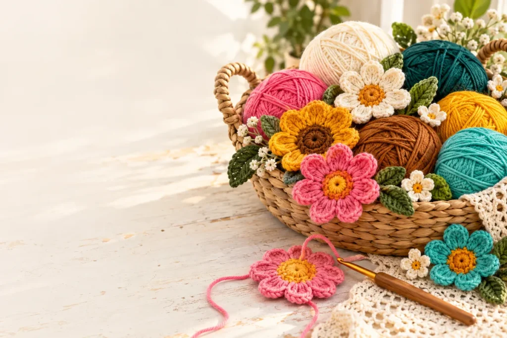
A colorful bouquet can feel lively and celebratory when the shades are balanced rather than randomly combined. Choose a dominant family, then add a smaller number of contrasting accents. This keeps the arrangement expressive while preserving a sense of order.
Bright colors can be particularly effective for birthday-inspired gifts, spring decor, or a playful workspace display.
Warm and cool directions
Warm palettes tend to feel welcoming and energetic, while cool palettes often appear calm and composed. Combining warm and cool shades can create contrast, but the balance should be deliberate. If every color has equal visual intensity, the bouquet may lose its focal point.
One practical design question is whether the bouquet should feel blended or contrasted. Blended colors create a gentle flow. Contrasting colors create clearer separation between flowers and can make individual blooms stand out.
Floral Styling Ideas
The color-planning concept can support several different decorative directions.
Romantic styling
Use a restrained combination of soft pinks, creams, and related light tones for a bouquet with a tender, gift-ready character. A simple presentation can keep the focus on the flowers and their color relationships.
Cottage-inspired styling
A more relaxed palette with varied floral colors can suggest a garden-like mood. The arrangement does not need to appear perfectly uniform; slight differences in color placement can contribute to a naturally gathered look.
Modern styling
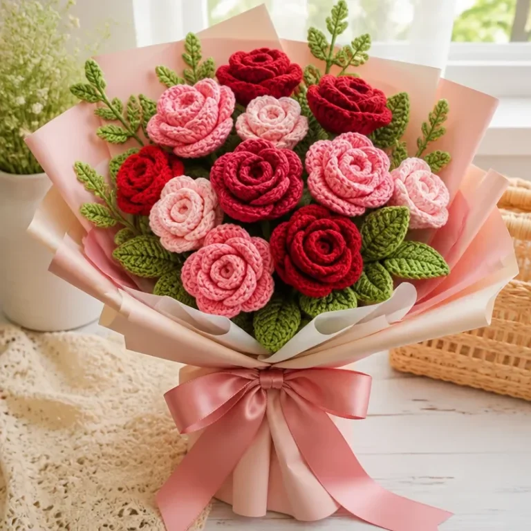
For a contemporary bouquet, limit the palette and allow contrast to do the work. A small number of clearly defined shades can look crisp and intentional, especially when the presentation is uncomplicated.
Seasonal styling
Color is an effective way to connect crochet flowers to a season without relying on technical changes. Fresh, light combinations can suggest spring, vivid warm tones can suit summer, and deeper or muted shades can create an autumnal feeling.
Seasonal styling is best treated as a palette decision rather than a requirement to identify particular flower species.
Presentation and Decorative Use
A color-planned crochet flower bouquet can be approached as both floral decor and a meaningful handmade gift. Its visual impact comes from the way the flowers are grouped and presented, not only from the individual blooms.
Possible uses include:
- A shelf or desk display with a coordinated color theme
- A handmade birthday or celebration gift
- Inspiration for a bridal or wedding floral palette
- A seasonal centerpiece concept
- A keepsake-style arrangement for a personal occasion
- A soft accent for a bedroom, craft room, or reading area
- A floral display designed around a recipient’s favorite colors
For gifting, color can communicate personality. A quiet tonal bouquet may suit someone who prefers understated decor, while a higher-contrast arrangement may feel more festive and expressive.
For event styling, a planned palette can help connect crochet flowers with stationery, table decor, attire, or other visual details. The flowers do not need to match every element exactly; repeating one or two colors is often enough to create visual cohesion.
Visual Variations to Explore
The same bouquet concept can be adapted through styling choices without changing the underlying crochet techniques.
Use one dominant color
Let one shade appear across most of the arrangement, with only small accents in neighboring or contrasting colors. This creates a strong visual identity and makes the bouquet easy to coordinate with surrounding decor.
Reverse the emphasis
If the original look feels accent-led, try making the supporting color more prominent and using the strongest shade sparingly. This can produce a calmer arrangement while retaining the same general color family.
Try a high-contrast palette
Pair a soft or neutral color with a deeper accent for a more defined appearance. The contrast can make individual flowers easier to distinguish and give the bouquet a more graphic quality.
Keep the palette nearly neutral
Cream, off-white, beige, and very muted tones can create a quiet decorative piece. Small color touches can then act as deliberate highlights rather than competing with the overall arrangement.
Change the presentation mood
A bouquet can feel formal, casual, rustic, or contemporary depending on its surrounding styling. Consider how the colors interact with the display setting, gift presentation, or occasion rather than evaluating the flowers in isolation.
From Inspiration to Your Own Floral Project
When planning an original crochet flower arrangement, begin with the visual result rather than with a list of individual flowers. Ask what the bouquet should communicate and which colors will support that mood.
A useful planning sequence is:
- Choose the overall atmosphere, such as soft, colorful, modern, or garden-inspired.
- Select one dominant color or color family.
- Add supporting shades that either blend with or intentionally contrast against it.
- Decide whether one flower group should act as the visual focal point.
- Consider how color will be distributed across the bouquet rather than concentrated in one area.
- Think about the final presentation and the setting where the arrangement will be displayed.
It can also help to decide whether the bouquet should be flower-led or palette-led. In a flower-led arrangement, the different bloom forms are the main attraction and color supports them. In a palette-led arrangement, the color story is the strongest feature and the flowers work together as a coordinated visual field.
Neither direction is more correct. The important point is to make the choice intentionally.
Keeping the Design Cohesive
Cohesion does not require every flower to be identical. In fact, a bouquet can gain interest from variation, provided there is a clear connection between the parts.
Color repetition is one of the simplest ways to create that connection. A shade that appears in one prominent flower can reappear as a quieter accent elsewhere. Similarly, a neutral or subdued tone can give brighter colors room to stand out.
Consider also the background. A bouquet with soft colors may need a setting that allows those tones to remain visible, while a bold arrangement can become the main decorative statement in a simpler space. The surrounding display should support the palette rather than compete with it.
This project’s strongest inspiration is the idea that handmade flowers become more powerful when planned as a collective arrangement. Individual blooms matter, but their spacing, color relationships, and presentation determine how the bouquet is ultimately perceived.
Frequently Asked Questions
What is the main focus of this crochet bouquet project?
The focus is visual planning for a crochet flower bouquet, especially the relationship between flower colors, bouquet composition, and presentation.
Are specific flower species identified?
No specific flower species are identified in the available project information. The design can therefore be discussed in terms of handmade flowers, color groupings, and floral styling rather than confirmed botanical forms.
What color palette should be used?
No single required palette is specified. The concept can be explored with tonal, monochromatic, soft romantic, colorful, or higher-contrast combinations, depending on the desired mood.
Is this a complete crochet pattern or tutorial?
No. The supplied information supports design inspiration and editorial analysis, not stitch instructions, construction details, or a complete pattern.
How could this idea be used for a gift?
A coordinated crochet flower bouquet could inspire a handmade birthday presentation, seasonal display, wedding-related arrangement, or keepsake-style floral gift. The most suitable palette depends on the recipient and occasion.
How can the bouquet look more modern?
A limited palette, clear color contrast, and simple presentation can create a more contemporary appearance. Keeping the visual choices intentional is more important than adding many different shades.
Conclusion
The central lesson of this crochet bouquet color planning guide is that a strong floral arrangement begins with relationships: between dominant and supporting colors, between focal flowers and accents, and between the bouquet and its setting. A carefully considered palette can make handmade flowers feel cohesive, expressive, and ready for thoughtful decor or gifting.
For additional crochet flower bouquet inspiration, explore these crochet flower bouquet ideas, then compare your palette choices with these bouquet color palette suggestions.